Jun
21
On Data Visualization
June 21, 2012 | 2 Comments
This won’t be a particularly long post, but it’s something that I’ve been working on a little bit that has excited me. There’s a lot of great javascript tools for designing sleek visualizations on the web right now (and to do with no more than just code!). Raphaël and D3 are among those which have gained a rather significant user base. So when there was some talk after a recent New Media Lab meeting about creating a visualization of the connections at play in the lab on a daily basis, I knew I was going to have a chance to put these tools to work.
Play with the demo here, but please keep in mind: this is not a permalink so if you’re coming from the future [or seeing this in 2013+] this link may no longer work.
But this isn’t all ////
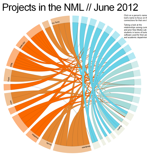
This was mostly a proof of concept. For example, not all departments and students are visualized here. Nor are all of the tools that they are using. But for a small selection [16 students, 13 tools, 8 departments and 15 students, you can already see that there are a lot of interesting connections and shared tools and methodologies at work here.
About the Visuals ////
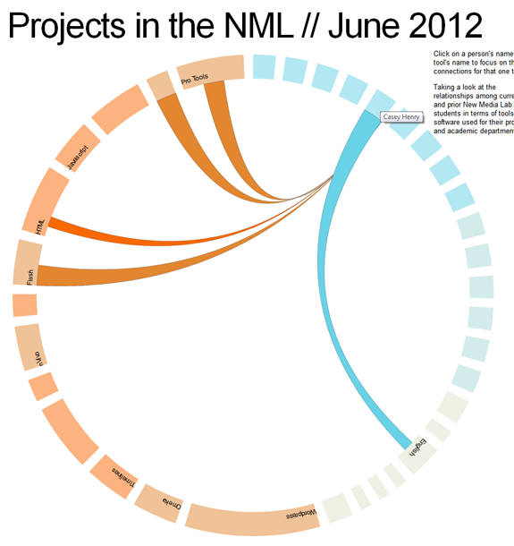
Current NML students are in the brighter shade of blue whereas our previous NML researchers are in a lighter shade of blue. Tools and methodologies are also differentiated by slightly different shades or orange. Currently the line width is generalized based on the importance of each tool to the corresponding student’s work. Something which is vital or a key part of the project is in a thicker strand; whereas a tool which was experimented with is in a narrower/small strand. For the final more complex diagram, these meanings will be more explicitly coded within the diagram.
But despite being a Proof of Concept, interesting patterns are clear ///
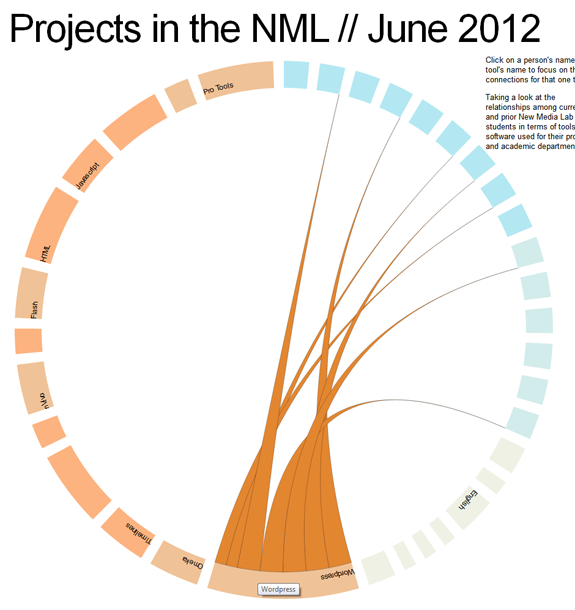
For example, we’ve seen a huge surge of interest in WordPress during the last 24 months. Even among this small sample set, this pattern is clear. Notice how the lines from the WordPress tool point to current students [the brighter shade of blue] more than graduated researchers.
Behind the Scenes ////
Basically both of these Javascript libraries provide a lot of tools and examples to work off of. So technical implementation is not significantly difficult. The example I made pulls data from a .csv file of student’s names, software names, and pairs it up with a .json file which contains array of the relationships.
Yes, this post also exists on the NML blog. I apologize to all of my devoted followers who saw this twice.
Comments
2 Comments so far


Also forgot to mention, the demo works in Chrome right now. It is not 100% cross-browser as of posting.
Darn cross-browser stuff! It looked really neat on the demo. Great color palate.