Jun
1
On Coding in the Digital Humanities
June 1, 2013 | Leave a Comment
A bonus entry. A post I wrote last September and never published. -Aaron
Among all the recurrent questions surrounding the mainstream emergence of the “digital humanities,” most divisive seems to be the question do you need to know how to code?
Sure, there’s disagreement. And although my post will hardly be the final word on the topic, I think as someone who knows how to code [and who has an educational background that’s entirely in the humanities, social sciences and design] it’s important that I weight in. My issue with the statement isn’t the end. Its in the beginning. You don’t need to know how to code, but why wouldn’t you want to know how to code?
On Argument from Corollary
1) If one is to be a scholar in the Classics [note the capital “C”] shouldn’t one know the language which the core texts of their chosen field were written in. Could one be a Classicist without knowing Latin? Or Greek? In the digital humanities the core texts are written in PHP, ASP, HTML and CSS*.
2) If you are studying a group, a people, a culture- one school of thought in how to conduct ethnographic studies says: “Ethnography is a social science research method. It relies heavily on up-close, personal experience and possible participation, not just observation, by researchers trained in the art of ethnography” (Genzuk, 1999). If you are studying, or becoming part of the ‘digital’ subculture, can on accurately weigh in without first becoming participating?
3) Perhaps a sub-corollary of point #2. Saudade. Sehnsucht. Waldeinsamkeit [one of my personal favorites actually]. Whether or not you believe that one’s language changes the way one thinks is another issue best left to the academic journals, it is important to note that just as languages sometimes have words or concepts that are unique to them and not easily translatable into other languages, so do programming languages. There are critical ideas underlying the “why” in the construction of digital works such as “recursion” or “object-oriented” [to name two of the more accessible ones] whose Raison d’être becomes clear once one understands the code. Or speaks the language.
On Bringing us back to the digital humanities.
So why should one want to learn how to code? I think there’s a few good reasons, and surprisingly none of them are akin to “eat your broccoli, it’s good for you.”

This was once the best argument folks could come up with for why it was important to learn how to program.
If you are going to be a digital humanist, you will be working with code, or at the very least, people who know how to code, for the rest of your career. Sure you can build a website without knowing how to code, but to build a tool, to radically transform something that already exists, or create something that does not exist, you will need to deal with the “how.”
Even if you are not going to build the application yourself, its important to understand how a language [and a set of skills] translates into something. It is now common in writing a digital grant to require the time or expertise of someone who will do the heavy lifting and difficult building. But if you do not understand how that person’s language affects what they’re building [point 3. Have you hired a Python programmer to develop your website? good to know how they differ from the woman who knows ASP.net]. If you do not know how code works, it can be difficult to manage programmers. It can be even more difficult to grasp the time involved in creating something. How many have worked with a self-professed a “digital humanist” that doesn’t understand that changing how a program functions isn’t as simple as removing a semi-colon from a piece of writing? This goes both ways, I’ve seen programmers who have taken advantage of the folks that have hired them and delivered something which meets the technical specifications but not the spirit in which the project was conceived.
Basically, as I see it, you have two options. You can hire a programmer who understands humanities tool building [and believe me, although we exist, there are not many of us. I don’t even consider myself a programmer first, but alas I digress.] or you can learn enough programming to converse with most any programmer. Some have called this level of literacy “procedural literacy” [warning .pdf] or “conversational PHP” [a colleague of mine]. This is probably the most basic level you might need to be at to efficiently administrate a grant for creating something new and digital.
The Power of Speaking the Same Language [another argument from anecdote]
The web was once ugly. Coders were programmers were once designers. Graphic Designers eventually started getting involved in the web and soon every staff had a “designer” who would make a layout. But there was some frustration as the coders knew what the new technologies [Javascript such as Jquery, MooTools, CSS etc.] could do, but didn’t know how to make them look nice. Designers new how to make things look good, but they didn’t know the language of the web. In short, web teams evolved to have a designer who knew the tools and what they were capable of. Both sides learned enough of the other’s language: Programmers learned how to talk about usability and user interface design; designers learned how to talk about code-reuse, CSS, HTML5. The web’s not perfect, but at least everyone knows enough about each other’s language to push things forward.
Back to the Digital Humanities Once Again.
Many others have written on this topic before, so I surely don’t expect to replace those seminal pieces. I consider myself a bit of a futurist, always looking ahead to see where things are going.
The future is going to be inescapably digital. I can easily foresee a time in the not-so-distant future the word “digital” prefacing anything will be seen as redundant. Can mid-21st century humanities be fundamentally “non-digital?” My guess is that someday it won’t be. Textual analysis may someday soon be as fundamental as elementary criticism in high school classrooms. Where will the digital academy be then?
And finally, on coding
TL;DR: coding is a powerful tool that opens more doors than it closes and creates more opportunities than it does barriers; and it will be an essential part of 21st century scholarship. As coding moves from the fringes of the DH community to the center, its an exciting time to be a part of the dialogue and movement.
—————-
*The latter two not really being “languages” in the same sense, and this list is by no means exhaustive.
Apr
26
Farewell (for now)
April 26, 2013 | Leave a Comment
It’s with great excitement that I embark upon the next challenge of my career, moving on to work for Teach for America. But it is with great sadness that I leave behind the Graduate Center and my work with the American Social History Project and the New Media Lab. I wrote a little about my time and a closing goodbye to the lab over on the New Media Lab blog.
It’s been a great pleasure to work with each and every one of you, and to see so many great projects come to fruition.
Sep
12
On Omeka 2.0
September 12, 2012 | Leave a Comment
If you’ve been working on a site using Omeka, you’ve hopefully caught wind of the new version that’s arriving rather quickly [October to be exact]. In my work with the American Social History Project/Center for Media and Learning, I’ve built two massive websites on the Omeka platform. The first, and most obvious: HERB was launched a couple of years ago. The theme is custom, but so are a couple of plugins that were written to radically alter the functionality.
Even more custom is a site built for a grant in conjunction with the American Antiquarian Society/Institute for Museum and Library Sciences. For a prototype site, several custom plugins were built to augment back-end functionality to add more room for pedagogical information.
So of course with the amount of custom plugins that were built [but fortunately, few of which got the time necessary to make them into public release] the forthcoming 2.0 mean some serious changes to the work I’ve done. But for pretty much everyone that hasn’t done serious plugin and custom theme work, this new version of Omeka looks to improve on several things from database architecture all the way to back end UI. And of course should be cause for excitement.
On Seeing What I Could (so far).
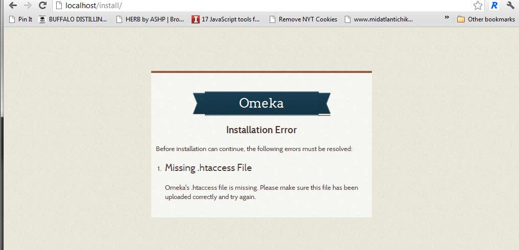
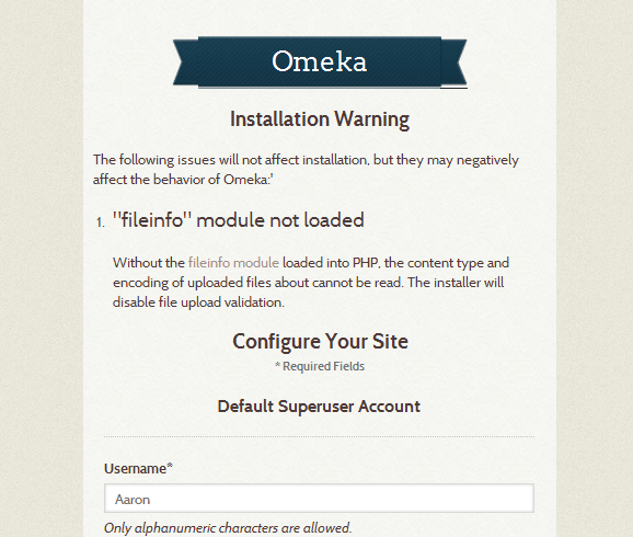
I downloaded the latest development version from Github with the full understanding that the Omeka dev group is still working and the screenshot I took was very much a work in progress. Although I didn’t get far enough to be able to test my plugins, I can say I saw a couple of promising things:
The warnings and backend setup panels already look more visually attractive. Warnings are clearer.
The posts from the Omeka team show a really sleek looking back end and even boasts promise of improved search functionality. Semantically, Omeka has even updated its terminology to not clash with the terminology used by library and database professionals. And finally, the code structure seems brought up into a clearer vocabulary as well, and seems at least a few steps closer to what experienced developers who’ve worked with more mature CMSs [such as WordPress or Drupal] are used to using.
I’ll post more once I get a chance to work on an Alpha or Beta version, and see how many of my plugins are up to muster in 2.0.
Sep
11
On Choices in OS [a personal history]
September 11, 2012 | 2 Comments
First, let us have a digression to set the stage:
In my spare time [as a hobby] I write and record music. And I’ve been hemming and hawing about what my new setup should be like. Currently I use a laptop which although acceptable, has latency issues. My M-audio firewire interface is over a decade old and the quality just doesn’t pass muster. Since I first bought my interface, my recording has become more serious, so I want something serious which will last another ten years; something which will enable me to get a professional sound at less than a professional cost. Enter the Apogee Duet 2. Consistently and highly rated by writers, friends and other people I respect. It seems to be the right tool for the job. The conundrum: its Mac-only. Well since I want to get into iOS development, it seems that the cards have been set out. I’ll buy a Mac.
On the Philosophy of Choice
As I’ve spent a large part of my 10+ year career in higher education teaching staff, students and faculty about technology, I’ve adopted a philosophy of “fundamental equivalence.” The right tool is the the tool that you prefer to do the job. The quickest way to turn off someone is to talk only about Windows to a Mac-head; to talk about mac only software in a room full of Windows users; to say that Firefox is superior for to Safari. These divisive debates rage in almost all corners of the technology world [flavors of Linux even? the right CMS?] and they get us nowhere.
On Why Choice Supersedes.
There was once a time when Macs were more well-suited for work in the arts. There was also once a time when Windows was the only OS suitable for use in an managed business environment. That time is called by historians and nostalgic undergrads “the 1990s.” Its been a long time since any serious technical person should be able to say with a straight face “Windows does that way better than a Mac” or vice versa.
Of course this statement, rather than being judging, should be freeing.
So you’re saying I’m free to use whatever OS I prefer?
Yes.
On Why There’s Something Worth Blogging About
So about three years ago I changed my DAW music production program from Sequel [Windows Only] to Reaper [Open-source, Cross-platform]. Simply put: Reaper was a better combination of price and capabilities. Again, just choosing the right tool for the job.
So I use Reaper, want an Apogee Duet, and need a Mac for learning iOS development*so it seems the most well reasoned conclusion is that “a Mac is the right tool for the job.”
But this announcement and decision has been greeted with some rather interesting responses. “I thought you were a Windows person,” all the way to “I thought you hated Macs.”
I will admit readily that for most of my development and daily use I prefer Windows. It doesn’t mean I don’t like the alternative as well. I nearly bought a Mac in college, but when it came down to stretching my grad school dollar, the right tool for the job was the one that I had already bought all of the required software for.
On Why Does this Continue to be Such a Divisive Issue?
So at what point does preferring one system cause one to be in opposition to the other? In the New Media Lab we maintain a cross-platform environment because we value choice [we even have Linux and we’ve had more than a few students schedule time on it]. But I am continually amazed at the number of people who seem shy to answer: Which do you prefer: Mac or Windows? Some have said that they were concerned that I might judge them adversely because they caught me using a Windows machine when they first met me. Or you have a shy Windows user who seems reluctant to admit they’d prefer not to use a Mac.
As a technologist, I think it might be perhaps a good thing to own one of each machine. In the lab I have one of each OS on my desk; in a previous job I had both as well. So just as one who asks a web developer “which browsers do you use?” [the correct answer is “all of them”] a technologist should be able to say- preference aside- I use all operating systems**.
On Concluding
This is a post I’ve been wanting to write for a while. Its been incubating. But it felt vital and exigent given my recent experiences in pondering a new machine. I don’t think this post brings us to anywhere new in the eternal discussion of “which OS should I use,” but instead is another personal history in the long struggle against meaningless choices that divide us all. Next up, Pepsi or Coke: why RC Cola is the only morally responsible way out of the cave***.
————————————————-
*I have done some Android too, so this isn’t an all-or-one proposition. I don’t think one can be successful in what likely will be a permanently fragmented marketplace without knowing both.
**Do others find this true as well? Or am I out on a limb here? And while I think familiarity with Unix/Linux is a plus, I’m not sure one needs to know BeOS to be successful
***I’m just kidding. Moxie.
Jul
26
On Creativity
July 26, 2012 | 1 Comment
Recently, Eathan Janney, a graduate student researcher in the New Media Lab from the Biology – Neuroscience department interviewed me for his Locateflow project about the nature of creativity. We had a pretty interesting discussion, and this is the one minute clip he produced out of our 20+ minute discussion.
Jun
21
On Data Visualization
June 21, 2012 | 2 Comments
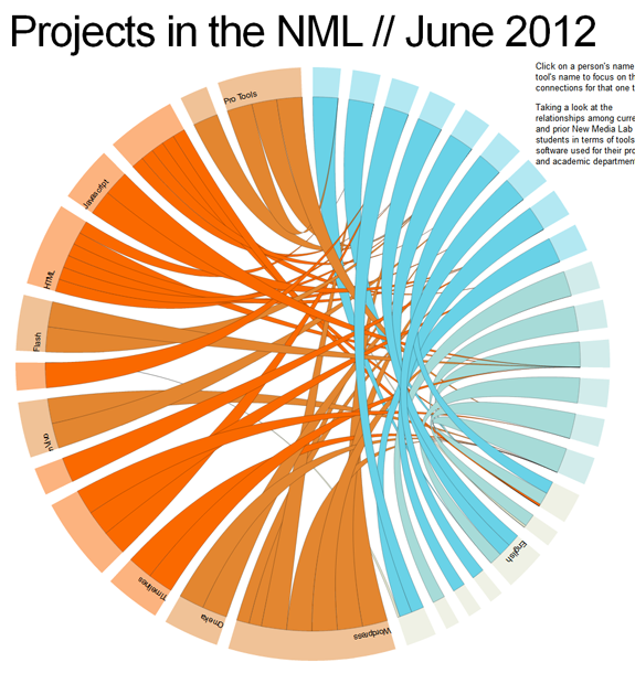
This won’t be a particularly long post, but it’s something that I’ve been working on a little bit that has excited me. There’s a lot of great javascript tools for designing sleek visualizations on the web right now (and to do with no more than just code!). Raphaël and D3 are among those which have gained a rather significant user base. So when there was some talk after a recent New Media Lab meeting about creating a visualization of the connections at play in the lab on a daily basis, I knew I was going to have a chance to put these tools to work.
Play with the demo here, but please keep in mind: this is not a permalink so if you’re coming from the future [or seeing this in 2013+] this link may no longer work.
But this isn’t all ////
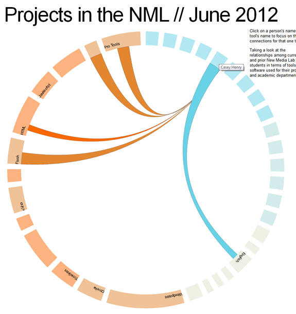
This was mostly a proof of concept. For example, not all departments and students are visualized here. Nor are all of the tools that they are using. But for a small selection [16 students, 13 tools, 8 departments and 15 students, you can already see that there are a lot of interesting connections and shared tools and methodologies at work here.
About the Visuals ////
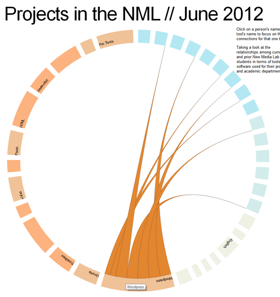
Current NML students are in the brighter shade of blue whereas our previous NML researchers are in a lighter shade of blue. Tools and methodologies are also differentiated by slightly different shades or orange. Currently the line width is generalized based on the importance of each tool to the corresponding student’s work. Something which is vital or a key part of the project is in a thicker strand; whereas a tool which was experimented with is in a narrower/small strand. For the final more complex diagram, these meanings will be more explicitly coded within the diagram.
But despite being a Proof of Concept, interesting patterns are clear ///
For example, we’ve seen a huge surge of interest in WordPress during the last 24 months. Even among this small sample set, this pattern is clear. Notice how the lines from the WordPress tool point to current students [the brighter shade of blue] more than graduated researchers.
Behind the Scenes ////
Basically both of these Javascript libraries provide a lot of tools and examples to work off of. So technical implementation is not significantly difficult. The example I made pulls data from a .csv file of student’s names, software names, and pairs it up with a .json file which contains array of the relationships.
Yes, this post also exists on the NML blog. I apologize to all of my devoted followers who saw this twice.
May
23
On Using Text Analysis Tools and Web Pages
May 23, 2012 | Leave a Comment
First, a little bit of an introduction. The easy part of any technical project is figuring out “how to do it.” Sometimes students in the New Media Lab come to me to figure out the “how,” and I am always glad to help. But my job isn’t simply to present the “how,” but to complicate* the “how” to help understand the potential ramifications of the technical decision. To do this, first I listen a bit to the description, the goals, the intentions, and then I try to help show how that tool sees this project to completion. This involves a deep understanding of the technology but also the research methods and the content at work.
This holistic understanding of web and strategy isn’t new. Private business and web entrepreneurs now place a high value on this kind of expertise. Around the mid 00’s, many top start-ups and established web companies began hiring UX (user experience) and UI (user interface) experts to redesign their websites and experiences. I don’t think its a coincidence that this was around the same time that the Ipad, the death of flash for website navigation, large text, the web 2.0 “actionable” look [you’ll know it when you see it] and other much ballyhooed easier-to-use web interfaces began popping up**.
Anyway, back to the post at hand: How can a complicated look at text analysis tools create a better (and more statistically valid) analysis of the web?
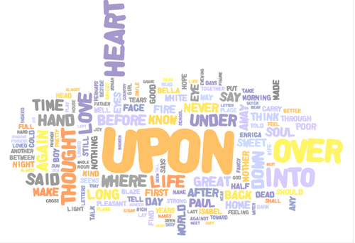
Text Analysis tools started innocently enough as a great way for scholars to analyze word frequencies in entire works of literature at a simple glance.
But what is key is to remember the medium for which these tools were built: corpuses. Books and literature follow a common design trope: title page, acknowledgments, some Library of Congress cataloging information and then the actual text itself. The proportion of ancillary material in a book is small in comparison to the text itself. Maybe 3-4 pages [200-300 words]: 200-300 pages [100,000 words]. Also, often times the ancillary data is not contextual to the book. The name of the publisher, the dedication, etc rarely are in the same tone and world as the book as itself. So although this prefacing information is easy to remove when analyzing a text. If you left it in, the words are not frequent enough in the introduction to significantly*** alter the results.
But the Web is a whole different beast.
Let’s say hypothetically that we wanted to a textual analysis of blogs in the digital humanities.
The first option that comes to mind is to use a tool such as a “website scraper.” These tools go into a webpage, follow all the links on a webpage to basically spider an entire webpage as if it were Google or some other search engine. It then creates an HTML backup of that entire site. A couple of the more common ones are Site Sucker [Mac OS only] an HTTrack website copier [Platform agnostic].
Point the tool to a blog of your choosing, and BAM! Instant backup of everything. So what’s the problem?
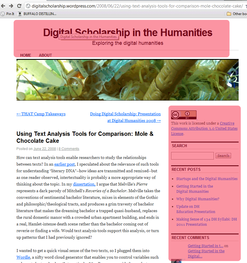
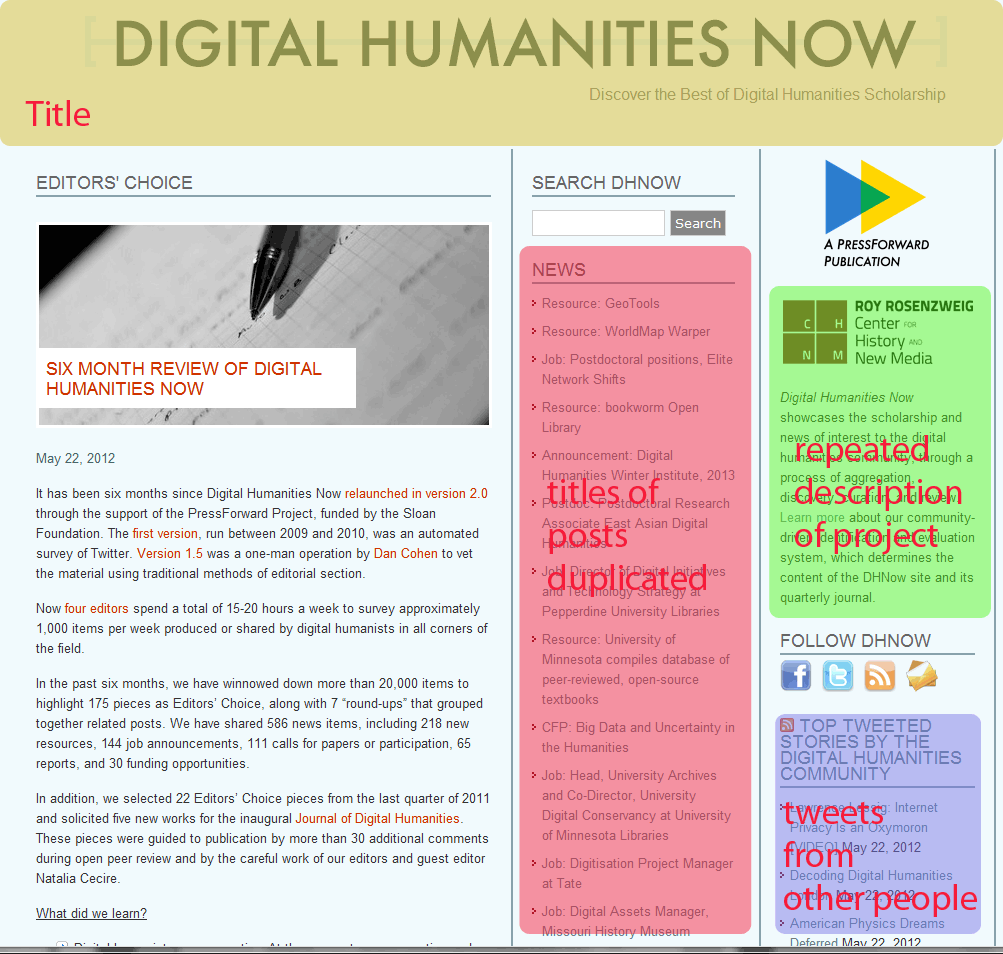
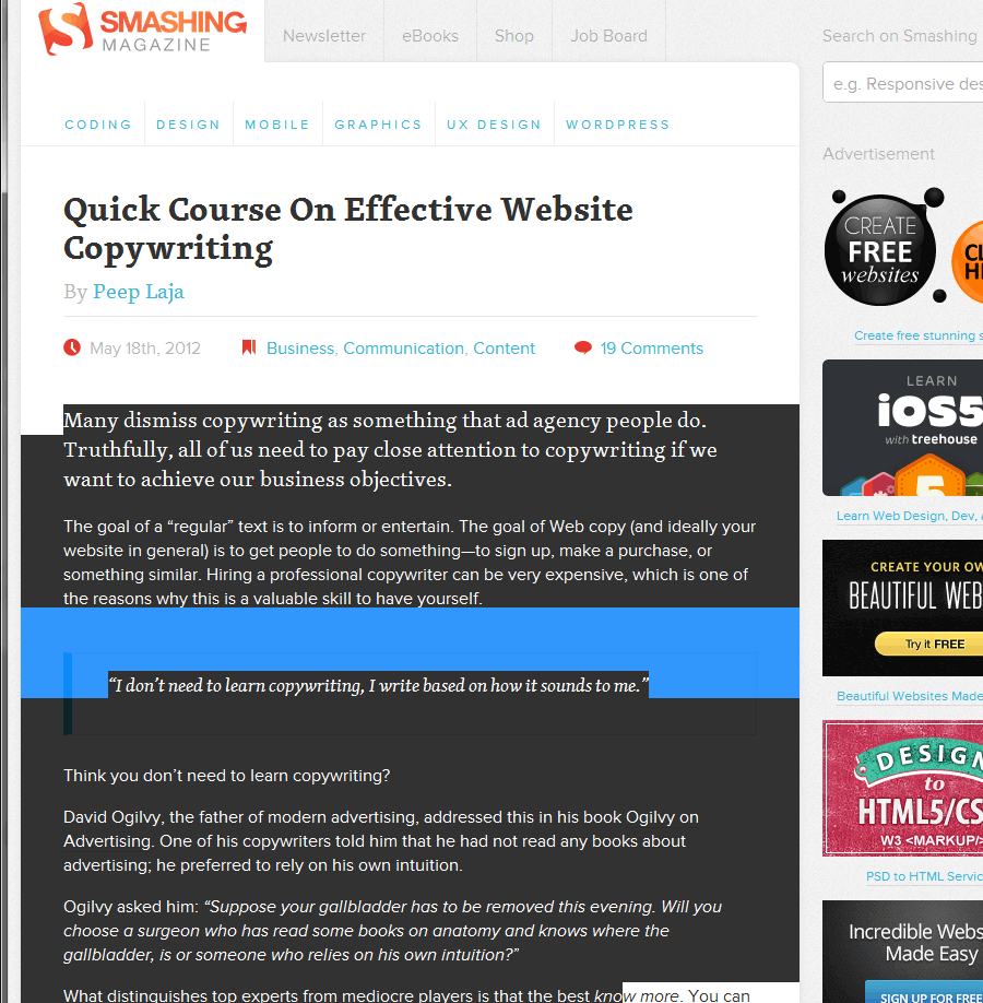
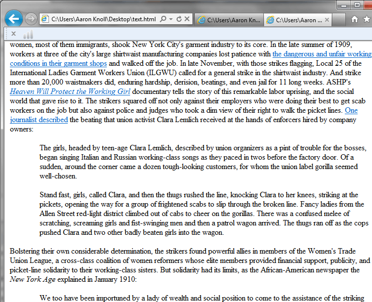
Notice that these are two separate screen shots from the same blog. If we had used Site Sucker, we would have had each of these as an individual file on our computer. Now say that we wanted to see how many times the word EDUCATION appears within our corpus. We’re studying digital humanities, pedagogy and the like and we’re really interested in how blogs on Digital Humanities talk about education.
How many times does the word EDUCATION appear across these two web pages? 10
How man times does the word EDUCATION appear in the actual body of the blog post that is unique to each page ? Only 1.
A detour, and an explanation
Every web page across all major blogging platforms is assembled from a database from a combination of components. You have your “title”, the description of the group that create the website, the list of the most recent titles, and most dangerous of all, you have the blue box in the lower right hand corner. This is the box that seals your fate: the random content from outside sources box.
This is the content that can change randomly and often times does not necessarily represent in a 1:1 fashion the topic of the blog. If you want to do a search or textual analysis, with some effort you could probably narrow your vocabulary**** to only use terms that do not appear in the titles, project description, category list, tag clouds, and other more predictable fields. (For a small number of corpuses, or a class project which has no further aspirations such as being published in a peer-reviewed journal, this might give you results which are acceptable).
Google’s Contextual Ad Words pose another huge obstacle to the scholar wishing to use websites for text analysis. They are the most insidious, as Google is using the same text that you’re analyzing to generate advertisements. And these advertisements can be unpredictable, vary from page to page, and often [due to Google’s particularly astute algorithms] going to have words in it which may be very similar to reason a scholar might choose to investigate a specific blog. Interested in how many posts on TechCrunch today talk about App development? The answer is 0, but the advertisements buried on the right hand column will give an artificial positive finding.
So what’s a Scholar to do?
As is my habit, I tend to present a few options. Let’s start with the simple and least technically complex:
If You are Dealing with a small body of text and have a high tolerance for tedious tasks.
You can simply copy and paste the text you wish to analyze into a plain text document. Copy only the entries, the headlines, the tags [if you want them]. This is the low-tech way that will give you the text you need with none of the ancillary information.
If You are Dealing with a fairly large body of texts AND you do not have access to the admin/backend of the blogs
This is one place where for most blogs you can make use of the RSS feed to make the job easier. Look for the “RSS” icon on a blog, or search for the words “RSS”, “Atom”, “Subscribe,” or “Feedburner.” Without getting into the differences in each of these technologies, what they have in common is that they will give you a text only print out of the content of the blog you are looking at.
This is not always a fool proof method. Some blogs do not show their entire content in the RSS feed; they often invite you to click more so that they get the ad revenue or website unique visits they need. Others actually have ads in their RSS feeds. These area couple of things you should look out for, but as a general rule I would expect that somewhere upwards of 90% of blogs do not have these things, and accessing an RSS feed is the best way to get only the titles, text, and images from a blog entry.
From here, it is a cut and paste operation once again, but with all of the entries printed one above the other, it is much easier to do a large number of entries all at once. No clicking from page to page, nor keeping track of where you’ve been [and haven’t]
If you are unfamiliar with how to use RSS, there are plenty of good guides online. It is fairly simple and in most cases you probably already use a program with RSS reading capabilities without realizing it.
If You are Dealing with a fairly large body of texts AND you DO have [or can get!] access to the admin/backend of the blogs
This is by far the most preferred solution, since most blogs allow the easy export of just the textual content. Major platforms such as Blogger, WordPress, and MovableType all support this, as do some less common blogging platforms such as Livejournal or OpenDiary for example. I’m only going to cover a couple to show you how it benefits you in getting clean text to perform textual analysis on, but suffice to say that this is possible on each platform
 On WordPress
Log into your admin panel.
Go to Tools –>
Click on Export
It now will ask you to choose “what to export.” This is the power of the export feature. You can for example analyze posts and pages separately. You can pick posts only by a category. Posts that were made in February. Etc.
You’ll now have an XML file***** of whatever content you’ve chosen to use.
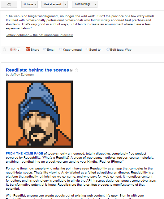
Open this XML file in any web browser of your choosing. What you’ll see will look a little bit like this image below. Notice that you only see the text and code that is behind the actual webpage. You can then save this file as a .pdf, .rtf, paste into a word .doc, and use directly in the text analysis tool of your choosing.
There is one thing to be aware of when performing a textual analysis of the body of this WordPress export. HTML tags are present in here. If you do an analysis and want to search word the word “em******” you will return a false positive every time the HTML tag for italics [literally, emphasized] is present in your document. If you want to be 100% sure, there is one more step you can take to ensure an HTML free corpus†.
on Blogger
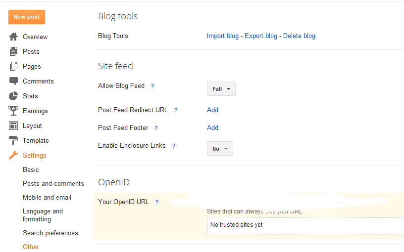
Go to your blog settings, to other, and then click on “export blog.”
And then click “download blog.”
Once again, you will have an XML file. If This is good enough for you, feel free to being performing your Textual Analysis. If you want to hide all of the code, let’s move on to the final step- converting this to an HTML file.
† Okay. Now that you have this XML document. Highlight all of it. Copy and paste it into a Plain Text editor. [Text Edit is NOT a plain text editor!] Notepad, Notepad++, even Dreamweaver. The save that file with the extension .html. Open in your browser and all of the HTML tags have been converted back into styled text.
On Concluding Thoughts
The process is surely a little daunting and a bit long. But none of the steps are complex. In the most basic form, we started with a body of text that had tons of ancillary content which could adversely affect any textual analysis we wanted, and in the end we have only the text which was written by the author. As I said, I can see how this process might be overkill for a quick word analysis such as Wordle. But if the operation is more complex and going to be fed to a program such as NVivo or Atlas [among others] it is worthwhile to ensure that the tropes of how web pages are constructed do not adversely affect the research that you want to perform using the web.
The web is a great source of data, and challenges such as dealing with duplicated content are hardly unassailable. They web/blog still being a rather new medium [and even more new for being considered worthy of performing scholarly research on] and therefore we are still in the infancy of learning how to deal with the trope and design patterns. But fortunately, with RSS being a standard, and export tools coming standard on most blogging platforms these days, these obstacles are easier to overcome today than they ever have before.
If you are doing some textual analysis of a blog, best of luck and let me know how it goes.
______________________________________________________
*This is to borrow a word that I have heard often at the Graduate Center.
* The relationship between UX and UI design AND the idea of a digital dissertation is actually quite a close one. But that is a topic for a later post.
*** This is a generalization, but in this sense “significantly” refers to statistical significance only.
**** But be wary, selection bias may cast shadows on your methodology
*****It’s not true XML. This is actually a WordPress specific format which is designed specifically for moving your blog to another WordPress installation. It will work fine for our purposes, even if the presentation may be disappointing to XML fanboys and girls.
****** Not really much of a word, outside of Scrabble that is.
May
7
On What’s in a Name?
May 7, 2012 | 1 Comment
Searching through a popular music blog such as Stereogum or Pitchfork, one could be easily mistaken in their attempts to understand a new generation of band names. Neologisms abound, name changes are frequent and even common names are frequently misspelled in outrageous ways. So what’s up with this? Is this more of that infamous “Me Generation Vanity?” Are popular bands just tapping into the collective inability to spell thanks to ubiquitous text messaging and twitter?
Hardly. Its just that career musicians happen to be given a flexibility that few others have in changing their names to meet the demands of our search-engine driven society.
But you don’t think that these sort of name changes are an epidemic?
Let me present a few examples. Owen Pallett once recorded under the moniker “Final Fantasy,” which also happens to be one of the best selling video game series of all time. Just this week two reasonable well known bands changed their rather ordinary sounding names to something more obscure. Danish Punk Band Offshoot “War”who had absolutely zero chance of ever ending up in the first 20 search results for their name changes to the significantly less competitive VÅR. Dive is another small project gone big who decided to change their name to the again- more unique “DIIV“.
And why not? Whereas Dive was nowhere near front page on Google material with their original name, the entire front page is about the indie rock project under the new search term.
I mean, of course the outfits claim artistic license. VÅR talks of a “new beginning,” and DIIV says they’ve “outgrown the name and its associations.” But whether they realize it or not, changing their name to something unique is part of a much larger trend. Looking for the latest single from Mike Snow? Good luck finding it on Google. But Miike with two “I’s?” First in your search results.
On the Larger Picture
In today’s utterly democratic wide open creative world, could Bob Dylan have stood out among all the other Bobs and Dylans recording folk music in their bedroom? Would Jimi Hendrix find making a name for himself much more difficult because Dr. Jimmy Hendrix has been practicing podiatry with his website since before he was born?
Musicians have caught on to the unique name trend*. Most of the well established new companies of the 21st century have done so with Neologisms. Twitter, Facebook, even MySpace. Good luck founding a company with a three letter acronym as a name in 2012. IBM? Good luck, every acronym has been taken. And if you can’t simply say to a person on the street the name of your company, have that person go back to your computer, and pull up your company’s website… I would go back and try to come up with another name [unsolicited advice].
This is the world that Google has built. While those of us who were born in a pre-Google time fiercely engage in friendly competition with our fellow name holders [I for example, have little chance of ever unseating Aaron M. Knoll as the top result for my name] will we leave our children to the same? Or will the phenomenon of “Google Unique” names catch on as a way of this generation giving their children the one thing that money can’t buy: a top search result in Google.
* one of the interesting asides is the groups that have not caught on to the trend, for better or worse. Look at the URLs for major studio motion pictures, and the rapid proliferation of bizarre domains for movies. Whereas in the late 90’s you would have been likely to see spiderman.com; the mid 00’s you’d see something like spidermanTheMovie.com; and currently you see names like summerofthespider.com. And to think, all of this could be easily solved by writing a unique script or coming up with a new character! [But I digress…]
Apr
16
On Great Power and Great Responsibility
April 16, 2012 | 1 Comment
I’ve never been much of a fan of comic books, but I’ve nevertheless found the quote “with great power comes great responsibility” to be an apt quote for many circumstances that arise while in the web profession*.
Today, I’m addressing designers of all types. The UX/UI/IDX and Front End types of the world. I’m imploring you to use the bold powers that JQuery has bestowed us for good only. Lightboxes (one such example: Fancybox) have become ubiquitous. And why shouldn’t they? Simple, intuitive, and it reduced use of the back button. Want to see an image? Click. View it. X out of it. Repeat.
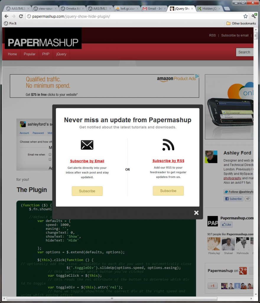
But lately I’ve noticed that this trope of web design has become a bit overused, and in particular in a way which could ultimately spell its early demise. I am talking about the modern stepchild of “pop up windows.”
But first a walk down memory lane.
It wasn’t that “pop-up” windows were inherently evil (they weren’t a great user experience, but that’s another story) but it was primarily how they were used. Although some sites used pop-ups for fair and legitimate purposes, it was the fact that they were used to deliver ads in a rather intrusive fashion that resulted in pop-up blockers becoming a standard feature in browsers by 2004. The abuse of them by advertisers resulted in all but banishing them from the web landscape by today**. This is why I’m concerned: because we have a good and highly useful UI element that is increasingly being used in annoying ways akin to pop up ads.
Let me outline the argument for them. People who like these lightboxes which appear upon first entering a website (note: the image above was what I saw immediately after clicking in from Google) will say that:
“You can still see the website, and it is clear and intuitive on how to make it go away.”
Is it a better user-experience than pop-up ads? Probably. But my concern is that the rising tide of these, designed to interrupt the search engine -> website process with an intermediary prompt are exactly what is going to result in the eventual categorization of these lightboxes as nuisances and eventually cause them to be stricken from the internet.
Though I chose a less annoying example above to highlight, it is important to look again to the users to see why this is a poor use of a new technology. Users have shown frustration with making additional clicks en route to their destinations which do not pertain to their goal***. We learned in the days of pop-ups that closing an ad was not considered a positive step towards a user’s goal in the early 2000’s. Is this extra step really any different?
If you don’t believe me, lets look at a couple of quotes from folks who work in marketing. What are they saying about Lightboxes?
[Lightboxes] are also great for advertising. Using a lightbox you can display your advertisement over top of your page when a visitor first arrives. This guarantees that the visitor will see your advertisers message and it is an easy way to create some valuable new ad space on your site. (September 2011 / Source)
…make them too unobtrusive, and you might as well not even have them at all. So where’s the balance? …Today I’d like to start an article series of three parts, the result of which will be a popout-style, jQuery-based box like the one pictured above, which I think strikes a nice balance on the obtrusion-scale (September 2008 / Source)
So what do we do?
I think that JQuery has transformed the user experience of the web rather dramatically in the last five years. I’d like to see this transformation continue. For this to occur, designers and coders will need to take a proactive approach to using tools for their intended purpose- which in this case is showing supplementary content in an intuitive fashion- and not for purposes which obstruct and interfere with the user experience.
I think it is inevitable that Lightboxes will be used for advertising. But if we as designers do not take a stand and attempt to ensure that advertising is done in other manners, it might not be such a far fetched notion that Google Chrome version 20 might be the first browser shipped for release that automatically blocks Lightboxes such as Fancybox.
What do you think? Have you ever been annoyed by a Lightbox? Do you find that advertising in lightboxes is less annoying? I’m curious what others might think.
* Although the quote is probably most widely known as being from the original Spiderman movie from 2002, astute non-comic-book types may wish to attribute it to Voltaire, who is the first writer to have written this popular line.
** The sold hold out that I know of is Netflix, which is still buying pop-under ads on websites.
*** This is a corollary of the “Three Click Rule,” which although is not really a rule, but a guideline which gets at the essence of how people navigate the web. The essence being that users are “generally goal-oriented” but this digression is discussion enough for an entire book, and also a digression which many have taken before.
Jan
19
On doing something cool
January 19, 2012 | Leave a Comment
Web Technology moves at a very fast speed. (obviously)
But the hardest part of being a web developer is the question of “when can I use this awesome new technology?” If you haven’t seen the site CanIUse.com, its a great resource for approximating what portion of the web is using a browser that supports said technology.
For example, @Font-face which allows web site designers to embed real fonts into web, rather than sticking to the same thirty or so fonts and creating fonts-stacks [nevermind this site’s “Mystery Meat” navigation, a blast from the dark past for sure]. Mainstream web use of this technology really took off in the last 12 months, once the percent of users supporting this technology crossed the 75-80% threshold.But even this was rather earlier because the font technology gracefully degrades. If you aren’t on a modern browser, you’ll see Arial. This is called “Graceful Degradation” and has been a buzz word since at least 2005, but its use among professionals goes back even further. Now this post isn’t going to be a long essay about the importance of designing with this in mind. Graceful Degradation is old hat, its part of the standard canon and really is at the foundation of modern web design. But I’m going to take this as a given, and talk a bit more about a decision I made on a website I personally run (my labor of love): The GIN is IN.
On the what and the why for that specific what.
I’ve been intrigued by the power of the web as a textual medium for a long time. Especially as a professional very interested in issues of accessibility (Section 508) and universal access, I’m really interested in the ways that a web page can implement a whole array stunning design techniques, tricks, and visualizations in a way that degrades gracefully and does so in a way that fulfills not just the letter of the law, but the spirit of the movement.
Little Known fact: I actually started my career as a flash designer. I picked up PHP a few years after I made my initial foray into design world. Actionscript (I think it was 2.0) was the first programming (not markup) language that I taught myself
So enter SVG. Of course Wikipedia explains all better than I ever could, so here is a brief explanation:
SVG images and their behaviors are defined in XML text files. This means that they can be searched, indexed, scripted and, if required, compressed. Since they are XML files, SVG images can be created and edited with any text editor, but it is often more convenient to create these types of images with drawing programs such as Inkscape.-Source
So naturally as a PHP programmer, I’m intrigued by the way that infographics can be created by using existing databases. Even more so, if you can build your graphic off of a user edited databases, your charts can change live as the content changes.
Secondly, SVG holds an interesting allure for me. Because although there are several great javascript visualization libraries out there, I’m personally biased and intrigued by the power that exists in plain old HTML.
On Audience
When at work, I always look for the most expansive technology. Javascript will work on pretty much every browser, and work reliably. There’s a great community and lots of examples of work with Raphael (WSJ uses it for its visualizations). But in my personal life, although I’d love the entire world to read my gin blog, I can deviate and experiment with doing things that I shouldn’t do at work. So inline SVG caught my interest and I decided that for the new visualization charts I wanted to make for reviewing gin that I would use this technology.
I didn’t choose it because it was going to appear on all browsers. In fact the most common version of Internet Explorer does not support inline SVG at all. If you look on IE8 you won’t see anything at all (yet). The newest version does support it. It won’t work on your Ipad (yet). But despite that I developed a feature (and wordpress plugin likely soon to be added to their archive) anyway. For the thrill of experimentation, for being an early adopter, and simply because I’ll have plenty of chances to use javascript libraries to create elegant all-platform websites. But fewer opportunities to do something just because.
On the Future of SVG
In my decision to use this visualization tool over the alternatives, I do commit myself to two sort of biases which I will own up to: 1) I think that SVG will be the most supported inline visualization tool in five years. Jquery is great, but it is separate from the actual browsers. SVG is built right in and does not require downloading any new libraries/frameworks as a developer. 2) I think that its important to see how things work behind the scenes. Sure Raphael works with the W3C specs. But I think its much more fun to go behind the scenes and make it work without a middle man.
I’m sure we’ll be seeing much more of these technologies in the future as more and more users choose browsers which support these tools. In the meantime, I’ll see how my Inline SVG experiment works out. Perhaps I’ll be moved to move it into a more widely supported method in the future, or perhaps I’ll take a shot at another fringe technology on the list.
